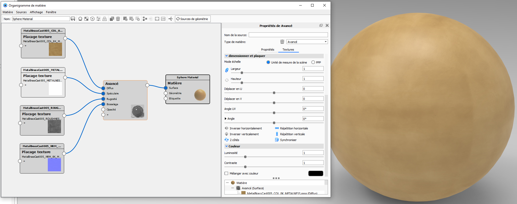
After watching these “classic” tutorials : https://www.youtube.com/watch?v=tdSYRFUWDRk&ab_channel=EsbenOxholm and https://www.youtube.com/watch?v=tdSYRFUWDRk&ab_channel=EsbenOxholm I can’t figure how to correctly use some Poliigon materials and maybe I’m not the only one. Usualy I manage to set them but sometime, the files are different (sometimes there is no specular or reflection) and I don’t know how to map them. ex : “DISP16” or “METALNESS”. I go crazy with a MetalBrassCast material. The best I can have is far from the preview… I do not know why. I think Im missing some elementary things… This is how I use the files with Advanced material : COL for Diffuse, METALNESS for Specular, ROUGHNESS for Rugosity and NRM for Bump but again, the result is very bad. Can somebody help me ? Thank you !
I don’t have a preview from this one but it looks quite like rusty metal, I used the Generic material since that has all you need I think
COL: base color of the material
GLOS: is the opposite of roughness, so tie to roughness and add an invert node
REFL: the specular amount
NRM: bump map
DISP: a lower resolution displacement map
DISP16: is a16-bit displacement map you tie to a geometry node
With PBR textures a material is basically either a metal or not a metal. So everything in between is non-existent in real life. Metal with a layer of paint is a non-metal for example. So if you have a METALLIC map it’s most of the time a black/white image. For example, if it’s damaged painted metal the parts where you see the bare metal would be white in the METALNESS image.
As you see here I just put a ‘1’ in the Metallic value since it might be rusty, it’s still a metal (right side of screenshot).
Some things to consider:
Depending on your material it’s not always needed to add the displacement map. A displacement map will create more geometry and cause longer render times and takes more (V)RAM to render. For example: I would never use it if it’s only a scratched material but if the material has some kind of structure and you do closeups you can use it for a more realistic view.
The DISP16 is a 16-bit displacement map and if I’m correct they get internally translated to 32-bit and will cause more memory to be used. The DISP is just a 8-bit image which will use less (V)RAM but because of the compression (I’ve a JPG here) also cause a bit of disturbed geometry. I think that if your scene has enough with the 8-bit you could consider to not use displacement at all.
Maybe others have something to add but this is as far my knowledge goes
I tried everything… I think I’m gonna give up with this material.
On the poliigon website I did not see that there is 2 versions of the material : “Metalness” and “Specular”. I tried the “Specular” version but I can’t have a good result. Here are some screenshots of the different results and a picture of how it supposed to be :
Mmmz I think the two versions are based on the two systems you have for materials ‘glossiness/specular’ and ‘roughness/metal’ and the last one is the PBR approach if I’m correct, more modern and easier to create a material from scratch just by looking at reference pictures.
KeyShot can do the glossiness way but you have to change it in the preferences. I would stick with roughness/metallic.
I don’t thing your versions are ‘wrong’. Well the top 2 ones. But with metals it’s really important how the surrounding is. If you use the default HDRI in environment you will never get the dark which is on the example. Simply because there is no ‘dark’ to reflect inside the metal.
So if you for example would use the dark studio environment from KS it will have way more contrast and your version will look more like the example. The thing with metals is that in reality they always reflect the surroundings even if they are quite rough/brushed, a metal looks really boring without a proper environment to reflect.
Like if you have a chrome object and you would place it in a single colour grey box with rounded corners there would be nothing to reflect and it would weird soft/grey without a shape which mainly gets defined by the reflection.
So I think there’s no need to get crazy yet, just pick another HDRI so you’ve more contrast in the reflection.
I think I just passed by the right settings and mixed my brain with too much try. The 1 in the metallic value make the difference ! and of course the environnement, ur right.
I am happy ! Thanks to you
Nice!! Looks good! Great post for others as well with your screenshots, I’m sure more people have difficulties with textures they buy. Every company who sells them has also their own way of doing things.